Today, we’ll talk about the queen when it comes to pushing the needle toward high conversions: the product page.
Your product page is where the wanderer turns into a potential customer—where the persuasion takes place.
Clicking the “add to cart” button is not an easy feat, but luckily there are CRO principles to implement, which will produce instant lifts for your brand.
#1 Showcase “add-ons”
If you have additional products that complement the main one, show them too. Relevant add-ons can increase your AOV and the customer’s experience.
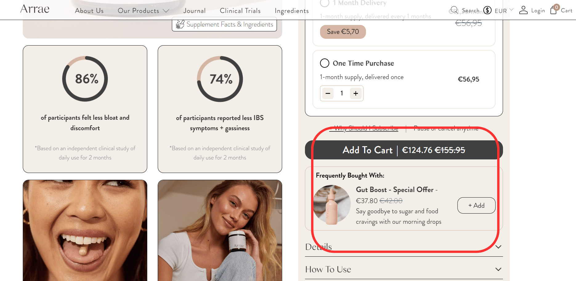
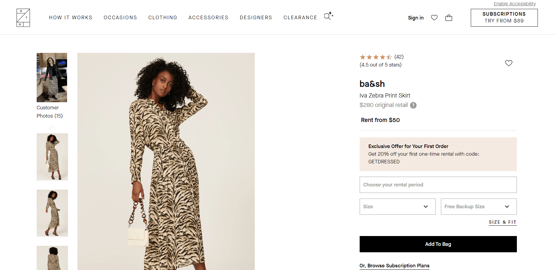
#2 Use social proof above the fold and near decision points
Social proof can take many forms. Above the fold, focus on these two: “X stars from Y satisfied customers” or an emotive testimonial.
Make sure that the testimonials stress how much and in what way the product elevated their lifestyle (kind of like a before and after).

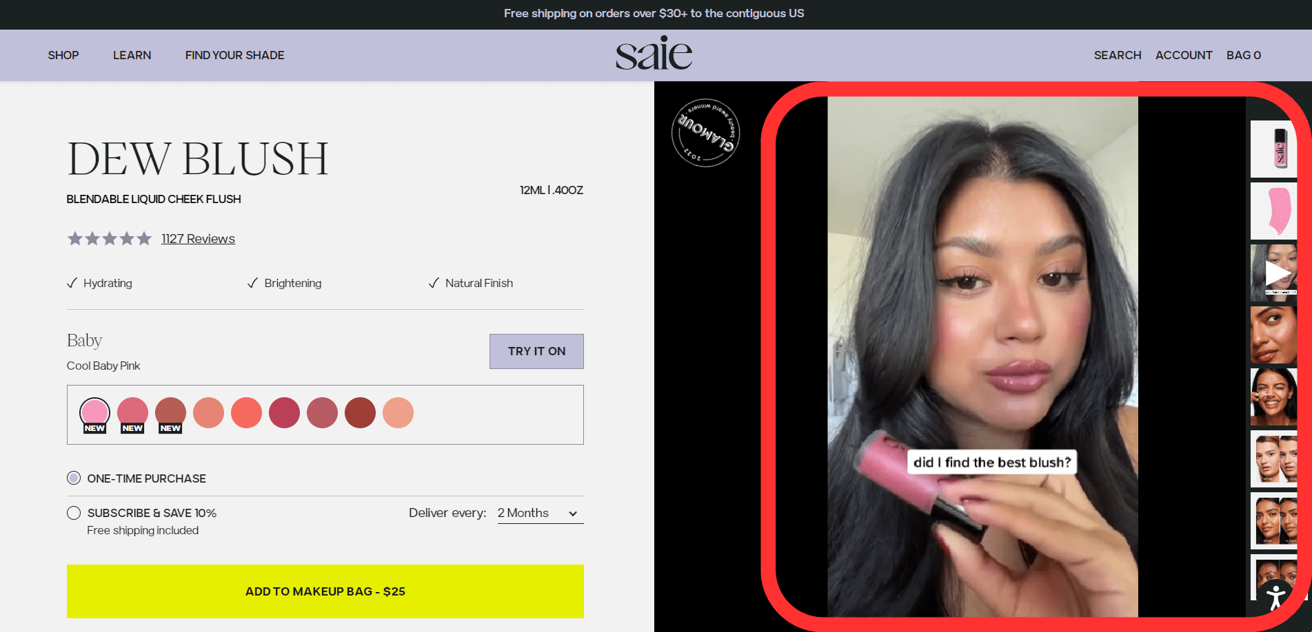
#3 Use different product images
A demonstration is worth a thousand words.
- Show your product from different angles.
- Offer seamless close-ups.
- Show in-studio professional shots.
- Show native lifestyle images that help the consumers feel the emotions that come with it.
#4 Prominently show a strong value proposition
Why not infuse a value proposition into the title of your product?
Analyze product reviews to understand what people enjoy most, and include this information in your product description to quickly communicate its value.
Product pages are all about preciseness.

#5 Go for “Add to Cart” instead of “Buy Now“
Buy Now, Order Now, and doing anything “now” implies that this is the shopper’s final decision, and there’s no turning back.
Add to Cart, on the other hand, feels “reversible”—it communicates a friendlier approach that can lead to more sales because it feels less pushy.
#6 Use a prominent color for your CTA
No matter the color scheme of your site, ensure the CTA stands out against the background with a contrasting color.
The eye should naturally be drawn to it, meaning it needs to be placed prominently within the page’s visual hierarchy.
Good CTA: Example in tips #1 and #2.
Bad CTA: Example in tip #3.
#7 Consider adding a video
Adding videos of your product in use can help people understand it better and see how it fits into their lifestyle. Bonus points if your product looks impressive or works in motion (for example a flowy skirt, or a fitness watch).

#8 Allow subscribe and save if applicable
Subscriptions typically resonate with lifestyle brands because they concentrate on adding value and enhancing daily life.
So If your product is a consumable, a subscription should be prominently highlighted on your product page—alongside clear benefits compared to a one-time buy.

#9 Eliminate common objections close to your CTAs
Do users worry about shipping times, return policies or which payment methods you accept?
Wipe out these common objections by including clear information close to your Add to Cart CTA.

#10 Add a short and punchy product description (or bullet points)
Find the balance between too much fluff and too little persuasion.
The description should do these 3 things effectively:
1. Call out the audience
2. Share unique selling propositions
3. Clear objections

#11 Offer an email notification system for when out-of-stock items come back in stock.

#12 Push urgency and/or scarcity when possible.
Highlight when items are low in stock or a special deal is about to end. FOMO is a strong tool to leverage.

#13 Show options for payment in installments.

#14 Offer order bumps

#15 Utilize white space if luxury
The more whitespace there is, the more the brand is perceived as luxurious. Aim for that clean, chic, minimalistic aesthetic with your design and copy.
#16 Highlight key features and benefits in the middle section of your page
Use the middle part of your page to dive deeper into what makes your product special. Highlight the features that make it a must-have.

#17 Show a comparison table in the middle/low section of your most popular SKUs

#18 Include user-generated testimonials
Showcase how others have integrated your product into their lifestyle.

#19 (mobile) Use a sticky CTA after a 25% scroll-depth
#20 Take care of the page load speed
Use Page Speed Insights to examine where your pages are at.
#21 Use a heatmap
I recommend this, this, and this tool (the first two are paid and the third one is free).
#22 Optimize for mobile
Especially when talking about lifestyle brands, the overwhelming majority of people visit from their mobile devices. Always use a mobile-first approach to your copy and design!